January 14, 2022
Analyzing Messages in Real-Time with SmartDispatch
Background
In the paper, “Creating Simplicity in the Workplace with NLP”, (Paterson 2021), I talk about using Natural Language Processing (NLP) to route or dispatch incoming emails to their appropriate recipients. We decided that an interactive demonstration of our SmartDispatch system would be more useful to our customers than an essay alone. This paper will walk you through how I went about building:
A dataset to use for NLP Machine Learning Model Training
A Deep Learning Neural Network to train our model with
A PyTorch Model Artifact to use for topic predictions
A PyTorch Model Artifiact to use for sentiment analysis
A RESTful API built in FastAPI to deploy the models
A front-end interface to display this functionality built in Streamlit
The Failed Dataset
I first wanted to find a good sampling of business emails in order to train the model. Since our clients will be mostly from small and medium sized businesses, ones that don’t necessarily have labels or tags in their email historically relating to their internal teams or departments, I wasn’t necessarily looking for a labelled dataset.
What are labels?
By “labelled” dataset, I’m referring to a set of emails or text messages that are each labelled with their topic or business department or function. With these two data points for each observation, the message and the label, I can train a model to know what marketing emails look like versus what an IT Helpdesk email looks like. A functioning model would then be able to predict the email or text message’s topic from a list of several options.
But those Emails…
In a cursory search, I quickly found the Enron Email dataset via the Kaggle website. This set of over a half million unlabelled emails became the foundation of our research. However, this proved problematic.
A big problem was that the emails in this corpus were predominantly interpersonal communications between colleagues. Since our end-goal is to create an email interpreter that will surmise the topic, tone or sentiment, and possibly the level of importance of an email as it enters the general inbound queue for a customer service team, we needed to be able to find clear differences in the text that could be coded.
But it’s a computer?
There’s a saying in ML that if a human can do it, then a computer can do it too. While not reflexive in every case, if a human cannot create a delineation between two written messages, then our current NLP capabilities in 2022 cannot do so either (ie., if I can’t understand your text message then Artificial Intelligence can’t do it either). Thus, rather than clear signals to indicate meaning, these interpersonal emails only added noise to our model.
Another big challenge with using this unlabelled dataset was our strategy for labeling it. Obviously, I couldn’t read 500K emails and label each as one of 5 categories by hand, that would take an inordinate amount of time. We thought about bringing on interns from the local University, but we decided that simply reading and labelling emails wasn’t a good use of anyone’s time, student or professional.
The LDA Model
There exist a number of unsupervised learning methods to deal with such a challenge. The NLP solution that is the most popular for this right now is called LDA, which stands for Latent Dirichlet Allocation. LDA is effective at creating clusters within a corpus of text by selecting similarities in the vectorized text, and then grouping text together into like categories.
A Cluster What-Now?
Clustering is a process by which the computer looks at similarities between data observations, in this case emails or text messages, and groups masses of them together in like-clusters. We do a similar thing in bookstores when we put the gardening books in one section and the sci-fi in another, and the poetry in yet another part of the bookstore. You can also think of how kids group up on a playground, or how in a city of a hundred thousand people you’ll find that the different bars each attract their own particular type of person. It’s like that.
Ready-made microservices
AWS has an LDA model at the ready in their microservice called Amazon Comprehend. While I later coded up my own LDA in order to have more autonomy over the fine-tuning of the model, I started off by asking the Comprehend application to label our 500K emails first into 3 subjects and then into 5. I actually repeated this step a few times as each individual pass of the clustering model can result in slightly different groupings of the text.
The Data Scientist can choose the number of clusters, but then in order to actually interpret and label them, it often takes a solid and focused human eye to read tens of emails in order to interpret how the model had clustered the texts. In one trial I clearly discerned a “Regulatory” category, a “Sales” category, a “Meetings/Travel” category, and a separate “Legal” category, leaving all else labelled “Interpersonal”. As sure as I thought I was here, there is no guarantee that your first or second or twelfth attempt will result in a reliably labelled dataset.
Death by Confirmation Bias
Often in our trials when it appeared that we were successful in labeling the emails with this approach, we would find after a day’s rest that our best clusters were a result of chance and confirmation bias in the sub-sample that I reviewed, and further the conclusions that I made didn’t necessarily map to the whole cluster.
To put it another way, I had seen the face of Keanu Reeves on the side of a building in San Francisco and thought that I’d discovered the Matrix (the movie not the nightclub). There were no clear labels for these clusters, I was only willing them to appear in front of me. Just as our eyes and our minds can play tricks on us (there is no spoon), our efforts to be good scientists can rival our human need to be successful creators (if my mixed metaphors were too much, there were no clear labels for the clusters in my trials after all).
Alternative Dataset
Given this realization, the second phase of our process involved shifting gears. This is where I found our winning dataset using the python Requests library to create a labeled dataset though an API to access social media posts.
Leaning on Past Experience
One of my prior projects in NLP involved using a free public API to pull posts and comments from social media sites in order to build myself a labelled dataset. Since I had this experience already, I went ahead and built a program that would hit the API and pull down about 80K posts and comments from 16 different labelled threads. I then labelled each with one of five topics, depending on which thread the message came from: “MachineLearning”, “FrontEnd”, “BackEnd”, “Marketing”, or “Finance”.
Good Data In -> Good Predictions Out
This proved to make a much more accurate predictor in the end. Essentially, we want to use natural, conversational language to train a model on the sequences of words that tend to be members of each of the aforementioned classes. For example, the goal is to train it to “know” the difference between the following:
{ ‘label‘ : ‘MachineLearning’,
‘Message’ : ‘We’re building a model in PyTorch to predict the topic of emails’}
VERSUS
{ ‘label‘ : ‘Marketing’,
‘Message’ : ‘We’re building our emails with drawings modeled on the Olympic Torch’}
Both of these messages contain the keywords “We’re”, “building”, “model”, “emails”, and “Torch”, yet each is clearly part of a different silo of the business.
To achieve our goal, we didn’t necessarily need to start with actual emails as our dataset. Instead, I could build a labelled dataset of key topics using an already-labelled source of natural, conversational language. Since the social media threads were already labelled with words such as “reactjs” or “javascript” or “webdev”, I could then put several of these together, in this case given the label of “FrontEnd”.
The NLP Transformer Model using Deep Learning
Finally, I took the 80K labelled entries, known as “documents” in the parlance of NLP, and used them to Fine-Tune a pre-trained Transformer model known as BERT. While our model is 80% accurate with 80% average precision at predicting each of the 5 topics, I could greatly improve the accuracy of this model by scraping more data, evening out the sample imbalance, and adjusting other hyperparameters in our training job.
We built a 5-class Classification Model by utilizing a process in Machine Learning known as Transfer Learning to fine-tune a pre-trained model. In our case, we utilized BERT, a model that Google pre-trained on over 3 Billion words from a couple of sources including Wikipedia to learn word embeddings and relationships through Bi-Directional Encoding using Transformers. (BERT: Pre-training of Deep Bidirectional Transformers for
Language Understanding, 2019, Devin, Chang, Lee, Toutanova, https://arxiv.org/pdf/1810.04805v2.pdf)
With the help of the Huggingface Transformers Library, we built out a custom library in PyTorch that I named Hermes after the Messenger of the Gods. As mentioned above, we began work with an LDA model in order to create labels for data that was previously unlabelled, and tried to apply this newly-labelled dataset first. This proved problematic for Hermes as the results were never better than a 42% accuracy, which is barely above a baseline model or null model. To clarify, in data science a baseline model, or null model, is the simple average (mean) of the target variable.
Put more simply, if I have 3 topics, “A”, “B”, and “C”, but my model always predicts that everything I put in will be part of topic “B”, then my model will be correct 33% of the time. If I have 5 topics and predict the same one each time, then my model will have 20% accuracy.
Since the first dataset, the Enron Emails, did not offer enough differences in their embeddings to Fine-Tune a pre-trained model with any reliable accuracy, we turned to our alternative dataset, the social media posts and comments described above.
Using my HermesDataset object, a custom built PyTorch Dataset (if you're geeky, this inherits from torch.datasets.Dataset) and the HermesPredictor library, I was able to create a custom PyTorch model artifact that predicted with reliable accuracy.
There are many like it but this one is mine
My model, called HermesModel_80.pt, can ingest a vectorized message and predict that message’s topic from the 5 options with 80% accuracy and 80% average precision. I know it’s pretty cool huh? After training the model on a GPU instance through a Deep-Learning optimized Amazon SageMaker Notebook Instance (p3.xlarge), I saved my model artifact to an S3 bucket so that I could access it later on a much smaller instance kernel and use it for inference.
While a fully-functioning and deployed model inside of a customer’s email queue could be trained to well above 90% accuracy using a larger training set, more hyperparameter tuning, and better control for pre-training sample imbalance, I’m very happy with the resulting application. I also used a sentiment analysis dataset that I have used in prior scholastic work, and I ran that dataset through the HermesPredictor library in the same manner to create a 90% accurate sentiment analysis model called HermesSentiment_90.pt.
Amazon Built-in Options
Amazon recently has created its own wrapper to fine-tune pretrained Transformer models using the Huggingface Transformers and other libraries. You can now use the SageMaker SDK, or utilize Amazon Sagemaker console, to deploy a pre-trained BERT model from the Huggingface library onto your dataset.
Unfortunately for me, in the short time I had to work on this project I did not find a good resource for building a data pipeline from raw text to a pytorch Dataset object that could be fed into the dataloader in a format readable by the BERT model. Thus, I chose to use native PyTorch outside of the sagemaker SDK this time, though I still called on Amazon’s SageMaker Notebook instances to utilize the CUDA GPU’s required by PyTorch.
The API
In order for us to put this model into production, it was necessary to create a RESTful API which could serve our model. According to wikipedia, “The REST architectural style emphasizes the scalability of interactions between components, … to facilitate caching components to reduce user-perceived latency, enforce security, and encapsulate legacy systems”. Thus it allows us to run inference on our model in the cloud and frees up processing time and reduces latency on the client side.
Jumpin Jack FastAPI
For this purpose I chose to use FastAPI as it is a 100% python solution. A lot of documentation around RESTful API’s on the internet are written with node.js or JavaScript programmers in mind, and for good reason–JavaScript is the ubiquitous language of our modern internet. However, as a Machine Learning Engineer who knows very little about utilizing the Document Object Model (that’s what our Front-End Devs are good at!), I appreciate a framework that allows me to build the API in very short time so that my model can be utilized faster in a production capacity. Think of a much faster time to POC, and you can bring in the paid web devs if the model is promoted to MVP.
Why So Fast?
FastAPI is also fairly lightweight and can run locally or in the cloud, serving inference from both models with minimal latency. We would increase the response speed of our downstream application by creating separate API’s for each model, possibly even creating a third API to handle the text encoding, and then running them from separate servers or separate virtual machines in kubernetes or docker containers, but our goal for this exercise is to create a demonstration application so for now, a two or three second lag-time requires no further re-tooling.
Also, the majority of our use-cases for this tech will occur under-the-hood of one of our customer’s enterprise email systems, although through putting our model into a FastAPI architecture, we could repurpose the model to work in chatbots, document review systems, or even internal help queues that review documentation for easy solutions.
The GUI Application
Finally, in order for a human user to interface with our API, I created a front-end application, or what is called a Graphical User Interface (GUI) using the Streamlit library in python. Streamlit employs some pretty easy pre-made HTML and Javascript to produce a front-end application that I can write entirely in python. As the developer, I only need to know the Python to use Streamlit.
As a Machine Learning Engineer, this allows me to iterate quickly, to develop my application on my own machine without the need for extra overhead, and it lets me produce this application without taxing the design or development team. Once a client asks us to build them a custom solution, the front-end team can then go to work to marry my API and Data Science Model to the customer’s color schemes, look-and-feel, and embed that naturally into existing software for their users if they want a customer-facing interface.
My Streamlit application can also be served from the same server or virtual machine that I serve the API from, however doing so can add latency since the server can only do one thing at a time–running code for the front-end app, the API, and inference against the endpoint sequentially.
Conclusion
In this paper I’ve walked you through my process to
Create and label a sample dataset
Train and save a deployable Machine Learning Model artifact in PyTorch
Build and deploy a RESTful API in FastAPI to serve the model
Build and deploy a Front-end application to showcase this to our customers
Whether you’re a little nerdish, or a full-silicon-jacket nerd like me, I hope that you’ve enjoyed this read and that you’ll consider the expertise that Cloud Brigade can lend to help your business move into a place of modernization through the embrace of AI.
Ocotber 27, 2020
Deadliest Counties Have Fewest White People
A recent study shows that US counties with the highest number of COVID-19 deaths per-capita contain the lowest percentages white people as a share of the population.
Using Data Science, a small team of software and machine learning engineers at Cloud Brigade in Santa Cruz, California have discovered that the single strongest indicator correlating United States counties with high rates of death per-capita as a result of COVID-19 is a high percentage of non-white residents in the population.
Looking at about three-dozen different factors and employing various machine learning models such as Linear Regression, Gradient Boosting Regressor, and Kmeans Clustering, the team was able to reasonably predict the levels of mortality and cases per-capita based on different levels of correlation from each factor, or feature.
The team factored in overall population, jobs per-capita, SNAP benefit recipients in a county, the number of people on Public Assistance, the number of Qualified Medicare Beneficiaries, the percentages of households spending more than 35 percent of income on their housing, the percentage of available low-income housing in a county, per-capita income, median household income, median family income, percentages of African American residents, Asian American residents, Latinx residents, Native American residents, and white residents, and other factors.
The results were clear as demonstrated by this graphic:
While the colors are different, the patterns clearly show the overlap of the deaths per-capita from COVID-19 on the right, and the white versus non-white populations (left)
The map on the left shows white population as a percentage of the county total, with the darkest blue being nearly 100% white and the lightest blue containing the fewest white residents per-capita. On the right, a nearly identical heatmap, with a different color-scheme, shows COVID-19’s deadliest counties in deep red, and the counties with the fewest deaths per-capita in yellow, with the orange colors designating the steps in between.
The maps clearly illustrate Native American Reservations in the west and upper-mid-west, areas in the Mississippi Delta and rural Georgia that have large majorities of African American residents, as well as majority Latinx areas such as south Texas, Arizona, and New Mexico; all of which are experiencing the highest death rates from COVID-19. You also can see that the multi-cultural areas around the San Francisco Bay such as Oakland, San Jose, and San Francisco do not have high levels of deaths per-capita displayed in the map on the right.
The team did not set out to find these details when they began the project. Unfortunately, this is what the data show us. This study does not suppose the causation of this effect, though there are obvious connections to per-capita income as shown in more detail at https://datademo.me. Here’s a look at the top 25 deadliest counties:
You can view the whole dashboard at https://DataDemo.me , and there you can scroll over each of the above rows and see it’s racial make-up. This bar chart is color coded by per-capita income, with the blue bars signifying counties whose per-capita income is above the national median, orange-red denoting below the median.
There are also new questions left as a result of this study, such as why do these mostly rural counties have a higher rate of death per-capita than tightly-populated Manhattan or Chicago? Is it a result of access to medical care in rural hospitals? Is it something else entirely?
The only question that the team had at the start of the project was just what factors could be discovered as correlated amongst disparate counties. In the spring of 2020, as COVID-19 was quickly spreading across the world, the machine learning crew tried to build some machine learning models to learn about this new disease. In the simplest terms, they wanted to find out if gathering copious amounts of data and running them through an unsupervised machine learning model could teach new things about the virus.
Heatmap displaying strong positive correlations (red) and strong negative correlations (blue) between various features. A feature above 20% is interesting, above 35% is significant
Unsupervised Learning is one of the three major types of Machine Learning along with Supervised and Reinforcement Learning. The purpose of the Unsupervised Learning model is to take datasets that are larger than a human eye can comb through easily, and to let the computer’s mathematical modeling algorithms attempt to cluster like datapoints with others. In short, the computer takes thousands (or hundreds of thousands) of rows of data, each row containing tens (or hundreds) of attributes, and it creates single points in multi-dimensional space for each of the rows of data. It then identifies clusters of these new data points and groups them together. This type of model is employed to detect fraud in online banking and ecommerce. After the model clusters the data, it is up to the researcher to then look at each of the clusters and identify why these things have been clustered together. Sound a bit esoteric? Think of it another way.
K-Means clustering is one type of Unsupervised Learning Model.
Photo Credit: https://www.iotforall.com/wp-content/uploads/2018/01/Screen-Shot-2018-01-17-at-8.10.14-PM.png
Imagine that you volunteer to help at a clothing drive and three thousand people drop off bags of donated clothing. If these people all dumped the bags into piles of loose clothing and walked off, it would be impossible to tell which of the piles had the most blue jeans, the most socks, the most bathing suits, et cetera. You would have an impossible time sorting everything out. But what if there was a way to scan each clothing bag, create some index number based on the contents, and then put groups of bags together with other bags that had similar contents (and index numbers) before you even opened them up? That’s the unsupervised model. Now you, the volunteer, can go to the first cluster, open up the bags and say “OK, these are the ones with lots of blue jeans,” and “those over there are the ones with lots of green hoodies.”
And that is what was done in this study. The researchers collated their data from the US Census Bureau, US Bureau of Economic Analysis, the US Department of Agriculture, and various COVID-19 data sources such as the Google Open COVID-19 Dataset, the New York Times, European Centre for Disease Prevention and Control, Global Health Data from the World Bank, and OpenStreetMap.
This group is now working on a timeseries forecasting model that incorporates the above data with weather data, updated local restrictions and masking policies, hospital admits and available hospital bed data, as well as considering the available medical treatments and vaccines to predict at the county level how the virus will spread and how deadly future outbreaks will become. You can see a dashboard of the work that they have done at https://DataDemo.me.
Matt Paterson is a Machine Learning Engineer at Cloud Brigade in Santa Cruz, California. He has been working in various Data Analysis and Financial Forecasting roles using various levels of technology from SQL and Excel to Python, Scikit-Learn, Tensorflow and Django since 2013. You can reach out to him directly at hello@hireMattPaterson.com
August 30, 2020
I found 34 new planets
Identifying planets orbiting nearby stars using a Recurrent Neural Network
—MATT PATERSON — hello@hireMattPaterson.com
I discovered some new planets on Friday...sort of. Using a Python Jupyter notebook, I employed Tensorflow and Keras to produce a recurrent neural network that predicted the existence of 34 previously unknown exoplanets in our interstellar neighborhood from a subset of about 2200 observations. Since I don’t trust the results completely, I wanted to share this project at its midpoint in hopes that other researchers or hobbyists might have some insight to lend, or that we can compare our predictions.
You can view my ‘quick and dirty’ models here
or
you can view my ‘deeper dive’ models here
Two weeks ago I set out to create a convolutional neural network that would be able to identify the presence or absence of a planet orbiting a nearby star using an image of that star through the lens of the Kepler space telescope, or some other telescope. It was an exciting idea, but as it would turn out, there are not easily accessible image datasets of nearby stars with the resolution needed for the model I was working on. So, as I have had to do previously in the business world, I pivoted slightly and successfully created a recurrent neural network instead. My neural network analyzes the public Kepler Objects of Interest dataset and accurately predicts the presence of previously undiscovered planets.
This article will be updated on or around Labor Day Weekend 2020 with new findings and better visualizations
I created several models before employing the neural network, including a simple logistic regression model, a random forest classifier (both in Python, Scikit-Learn), and a feed-forward neural network with dropout (Keras). The recurrent neural network was the fourth model, which I tried after seeing a 96% accuracy score from my random forest, and as Charles Rice of General Assembly put it, “Deploying a neural net on a dataset this small is a bit like sandblasting a soup cracker, but it does seem to confirm the strength of the random forest [classifier].”
The exoplanet identification model in any form is a binary classification problem. Machine Learning models attempt to numerically predict the unknown, and typically a classification model will predict either a 1 (yes, positive) in the case that we are looking at an exoplanet orbiting a nearby star, or it predicts a 0 (no, negative) in the case that we are not looking at an exoplanet. To oversimplify, a logistic regression uses a sigmoid function to do this, rendering all results between 0 and 1 and assigning the class of the closest integer.
The Random Forest Classifier is an ensemble model that takes the best results of many randomly created decision trees that employ a gini algorithm (there are other decision algorithms in use, but I employ the gini). Over many iterations, the model learns which features from the original dataset, or more appropriately which combination of features, best indicate the class of the observation.
I was surprised that my accuracy scores on the Random Forest Classifier and the Recurrent Neural Network were over 96% and 99% respectively, and I truly thought that I was doing something wrong since I hadn't done much model tuning at that point. My data’s null hypothesis, baseline average, was 35% ‘Confirmed’ (exoplanets) and 65% ‘False Positive’ (not-exoplanets). The misleading use of the term ‘False Positive’ aside, I improved the accuracy of predictions from 65% (if we guessed every observation to NOT be an exoplanet) to over 96% simply by putting my baseline data into each of these models. That means that either the NASA scientists did all of the hard work on cleaning the datasets (I still had to clean the data, but again, the point is I didn’t do much to it), or that my models actually don’t work at all.
For now, as I said, I’m only halfway through this particular project. While I am actively tuning my model, running feature engineering and trying different combinations of features, I would love to hear what has worked for you in your attempts to predict the exoplanet existence, and more importantly what hasn’t worked.
Thank you for reading part one of this blog. Feel free to email me directly you’re your suggestions, and please come back next week to see the results of this project!
August 13, 2020
Covid-19’s Deadliest Counties
The Risk of Overburdening our Medical Infrastructure
—MATT PATERSON — hello@hireMattPaterson.com
The Novel Coronavirus will kill over 185,000 people in the United States by the beginning of September, 2020 (just a couple weeks from this writing), according to the Institute for Health Metrics and Evaluation (IHME), with the highest concentration of deaths per capita found in rural Georgia and the Mississippi Delta.
As part of our studies in Data Science, and to practice using Linear Regression and the KMeans algorithm at General Assembly, Matt Burrell, Eric Laverdiere and I set out to study how the impact of COVID-19 on our healthcare infrastructure might cause an overburdening when a natural disaster such as a hurricane or wildfire occurs. We drew data from the COVID-19 Data Repository by the Center for Systems Science and Engineering (CSSE) at Johns Hopkins University, the IHME, Google’s BigQuery (a SQL database), the USGS, the US Census Bureau, and NOAA (links) . We used pure data to evaluate the risks and created a dashboard in a Tableau API to show our findings (you can also view our github repo ).
Our findings were interesting, though short of our intended scope. One of the largest barriers we faced was the quality and consistency of hospitalization data regarding COVID-19. While the sources were solid and accessible, they were not complete. There is even an article from July 21 in the New York Times stating that the federal government is specifically not releasing the collected hospitalization data at the county level. I was able to use the state-level data for the available states to create a linear regression model that could predict the number of people hospitalized. That model had Root Mean Squared Error of 1060.29, or in other words, I could predict give or take 1,060 people how many a state would see in the hospital as a result of COVID-19. With this, we can reverse engineer an estimated number of cases in the state using the deaths per hospitalization, the number of deaths outside of the hospital, and historical data for other respiratory illnesses regarding the estimated percentage of people that are hospitalized versus the estimated number of cases for a given time period. Despite having a relatively low error estimate, I didn’t think this statewide model was the particularly useful to our purposes considering it is on the state level and not the county level, making staffing forecasts and extra disaster relief planning impossible.
The next big pain point in the data is the number of “confirmed cases” of COVID-19. Confirmed cases data, which in and of itself is scary (we passed 5 million Americans confirmed to have tested positive with COVID-19 in the second week of August), has become a political football regardless of the color of your party pennant. This is true for many reasons, such as the variety and reliability of the individual tests. In other words, are people receiving a higher number of false negatives or false positives from each brand of test? Also, availability and accessibility of the testing is not constant. A person who is showing symptoms of COVID might not be able to get a test in every city, or healthcare workers in many counties are denied testing until they show severe symptoms and have already tried waiting out the illness at home in self-quarantine. This also questions the quality of the testing sample: are the people that are tested showing symptoms at all, and if so are they only the most drastic of cases? In some areas a person with no symptoms cannot get a test and in other areas people are being tested multiple times per week regardless of their temperature. Is this consistent from one county to another or from one state to another? No it is not. If there could be millions of positive cases out there showing no symptoms, there is no objective way to infer where they are geographically, or where the opposite might be true.
Our study sought to avoid all of those political arguments. We want to know what the data has to say. We don’t want to tell the data a story when it has a story of its own. It should be noted that testing is very important to controlling the spread of the disease, as is evidenced by many prominent people having to be tested before coming in to contact with other prominent people, but as a purely statistical look at the actual size of the spread of COVID-19 on a local and national level, we looked at the number of deaths from COVID-19 per capita. This was the only currently-available datapoint that was consistent and reported without caveats.
The map below shows every US county, over 3,000 of them. Each county is represented by a small dot, and the dot is color coded according to the scale in the upper right of the figure. You will notice that counties with high per-capita rates of death are colored red, such as Hancock County, Georgia with 402 deaths per 100K (the deadliest in the country as of July 31, 2020), and that counties such as Potter County, Pennsylvania that have 0.0 deaths per 100K are colored blue. The colors range to different shades of orange in the middle.

What was quite surprising was that rather than places like Detroit, Boston, and New York City being the deadliest per capita, we see four out of the five deadliest counties in the United States were in rural Georgia. We can also see that the Bayou, the Mississippi Delta region, and parts of Alabama and the Florida Panhandle are equally high on the deaths-per-capita range.
Here is a list of the 25 deadliest counties in the United States as of July 31, 2020, taking the total number of COVID deaths divided by the total population of the county times 100,000, to yield the number of deaths per 100K people:

It should be noted that Hancock County Georgia has around 10K residents and as of the last census, it was around 78% African American. Also at numbers two, three, and five are Randolph, Terrell, and Early County Georgia. With populations around 8K, 10K, and 11K respecively, and with populations that are about 63%, 62%, and 50% African American respectively, this very shallow dive in to the deaths per capita number suggests that something very dangerous is happening in rural Georgia.
Equally alarming, the number four county, McKinley County, New Mexico, is about 75% Native American. At roughly 14 people per square mile, this county is also quite rural by any definition. It is intuitively easy to see a dense city such as New York or Boston have a high rate of deaths due to COVID during cold winter months when people pack indoors and rely on packed subway cars and busses to commute to work when they aren’t privlidged enough to have work-from-home situations, but why these rural populations? And is it a coincidence that they are made up of minority populations? Again, this study does not have numbers on access to hospitals or medical care in those areas, it does not have empirical data concerning what type of work these populations have or do not have, whether they are able to stay home and isolate or not, or whether these particular counties are themselves more susceptible to respiratory illness due to pollution or other factors. We are purely dealing with the number of people that have died in a population as a percentage of the total, and what additional strain this could add to our healthcare system should a hurricane or tornado or other natural disaster present itself in the midst of this pandemic.
Wanting to make things easier to view from a wider, more regional standopoint, we broke the three thousand counties in to three hundred regional clusters using a KMeans algorithm, and then plotted them in the map below.

Here you can see the average regional deaths per 100K if you go to the Tableau API and hover your mouse over any of the cluster centroids. What really jumps out in this regional clustering is the severity of the deaths per capita in Northeastern Arizona as well as neighboring New Mexico on Native American Reservations.
This regional cluster map also shows that New York, Northern New Jersey and Southern Connecticut do have the highest regional average in the country after those Native American Reservations, but it should be noted that The Brox was number 7 on the deadliest counties list, with most of the top 25 being rural counties.
The lack of time-series sensitivity in this data hides the dangers that are faced in the rural south. We know that New York, Boston, and Detroit all faced a serious battle with COVID-19 and lost a lot of lives to the disease in April and May of 2020, contributing to an outsized proportion of the first 100K deaths (over a third). However, as the weather heats up and the population in the southern states are looking to the comfort of air conditioning, their proximity to one another might be part of the danger that they face in spite of their lack of normal population density. We would be able to make these inferences better with a timeseries model such as ARIMA, and may tackle that in the coming weeks.
Finally, talking about the weather, we looked at several natural disaster situations. Our Tableau API goes into detail on the historical data over the last twenty years regarding earthquakes, drought, wildfire, tornadoes, and hurricanes. This being August, it is currently both tornado season in the Midwest, Texas, and the South, and hurricane season in the Southeast and the Gulf Coast. You’ll notice in the map below that we identify the areas with the most property damage over the last two decades, and they are in the same areas that are currently seeing the death toll from COVID-19 spiking. Here is where the medical infrastructure question comes in.

If a hurricane like Katrina were to hit New Orleans and the Mississippi Delta this year, or to rip through Georgia and the Carolinas, we would have a situation where people who were evacuating flooding and storm damage might be asked to hunker down together in close quarters in high school gymnasiums and indoor sports facilities. These temporary shelters would then become Coronavirus petri-dishes, effectively creating an environment with people sleeping within six feet of complete strangers, when the best qualities of our humanity, compassion and love and empathy, would be the very things that would exacerbate this pandemic in areas where hospitals that are already seeing in influx of patients due to COVID will now be taxed beyond their capacity. Add to that any trauma victims from the storms themselves, and it’s a very fast slide into a medical infrastructure overload.
Again, our study did not look into qualitative political factors. The model does not consider that the Governor of Georgia invited people to return to the barber shops and nail salons as early as April while other parts of the country wore masks and maintained social distance and reduced the number of people they were in close contact with. There is neither a control group within such an area nor the pure data to compare it. However, I am sure that given the time, either one, some, or all of us in this project would like to investigate the timeseries data around COVID to show how the pure numbers around this virus have changed in each county in relation to steps that local officials took in its handling.
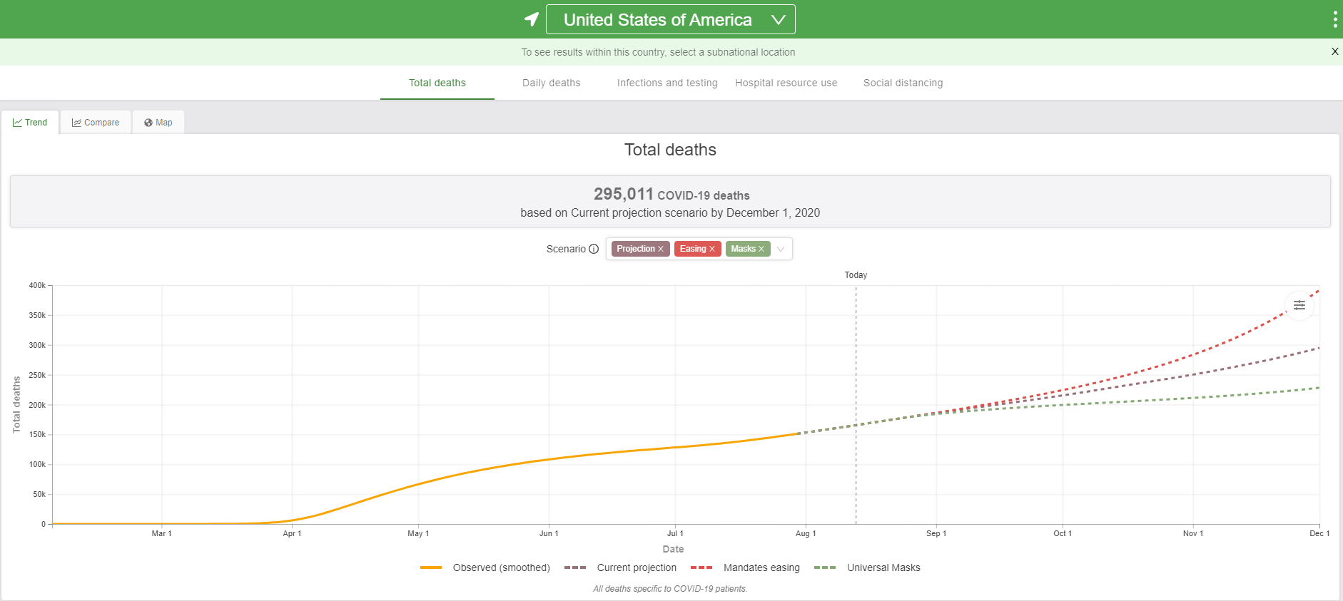
While our model avoids this data, I would like to simply link and share this graphic that the IHME created that does have applicable data and models how the use of masks and other precautions could prevent between 100,000 and 160,000 additional deaths by December 1, 2020:
I for one would be very excited to do a project with the IHME that allowed me access to the hospitalizations data, including admits, discharges and deaths, as well as which tests were available to whom and in what quantities and geographic areas.
The main findings that we came to in this study, however, were that the existence of this data does allow FEMA or other NGO or government relief agencies a head start on where we need to send additional medical resources ahead of the next possible disasters. It also is a great starting point in investigating why certain rural populations that have been historically subjugated in North America are seeing such high rates of death—around forty times higher than the national median rates of death per 100K.

In summary, be it a wildfire in Arizona or Southern California, or a Blizzard in the Northeast, or a Hurricane in the South in the next six weeks, we will see a situation where a normally occurring extreme-weather event will exacerbate our COVID troubles, and the question is how do we prepare ourselves for that to minimize the damage to our communities.
If you’d like to hear more or see what kind of other work I am doing, view my resume (using the button below, or the button next to my recommendations linked at the top of this page) and please shoot an email to hello@hireMattPaterson.com.
Matt Paterson is a Machine Learning Engineer in Santa Cruz, California and is currently a Data Science Fellow at General Assembly.
The Tableau map linked in this article was created by Eric Laverdier, laverdiere.eric@gmail.com. He used earthquake data that he cleaned and analyzed after pulling it from the USGS. He also used data provided by Matthew Burrell, matthew_burrell@outlook.com , that can be found at the NOAA, and COVID-19 data compiled and cleaned by Matt Paterson, hello@HireMattPaterson.com. The population numbers were pulled from the United States Census Bureau and the COVID data was found in several repos including the following: -COVID-19 Data Repository by the Center for Systems Science and Engineering (CSSE) at Johns Hopkins University -https://github.com/CSSEGISandData/COVID-19 -https://github.com/nytimes/covid-19-data -Google BigQuery -https://covid19.healthdata.org/united-states-of-america